The brand

The logo, a microphone leaning on top of a room with the door open, lends itself to various elaborations, and is mainly set against a circle.
First Contact
Opening of the scouting campaign 2015-16, the Next Space Age leitmotif of the two University parties continues, bringing it back to the forefront. This is the first time the elaboration of the logo with the multiple coloured circles was published.
A Night at the Radio
For the end of the year party, sponsored by Redbull, I designed this campaign affiche and circular leaflets introducing a new aesthetic to the communication of Radio Statale, which perfectly matches the minimalistic design and “next space age” concept.
Spring line-up


Cover art for the seven new shows launched as an extension of our line–up, the second season of Radio Statale transmissions. As in any project of this magnitude, evolution is slow and made of small, but decisive iterations. Compared to the initial format, this collection begins to vary the textures blended on the gradient that colours the image.
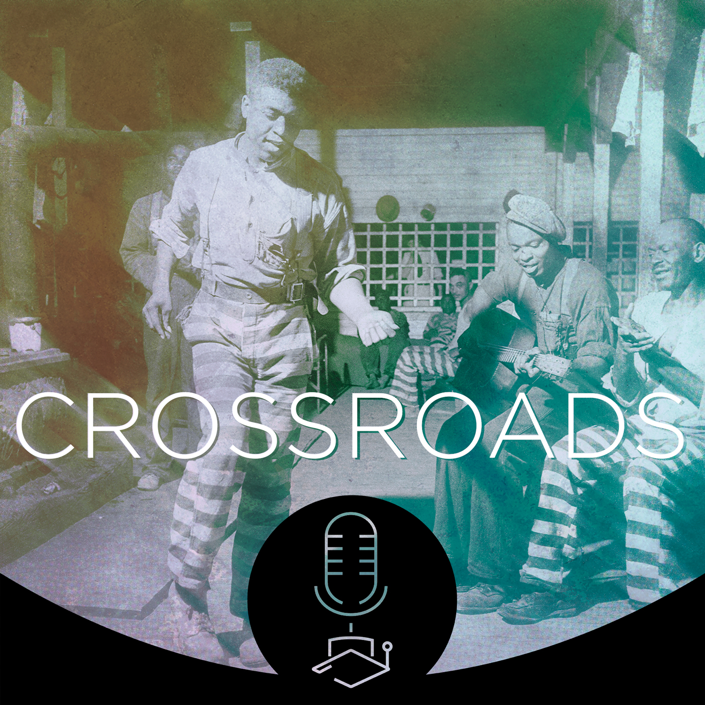
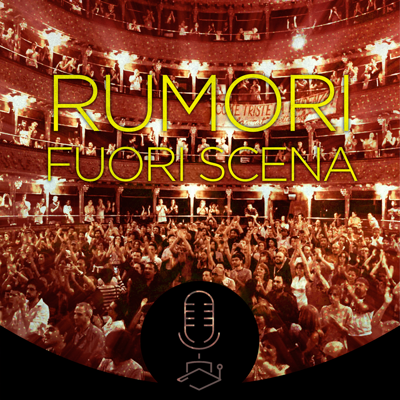
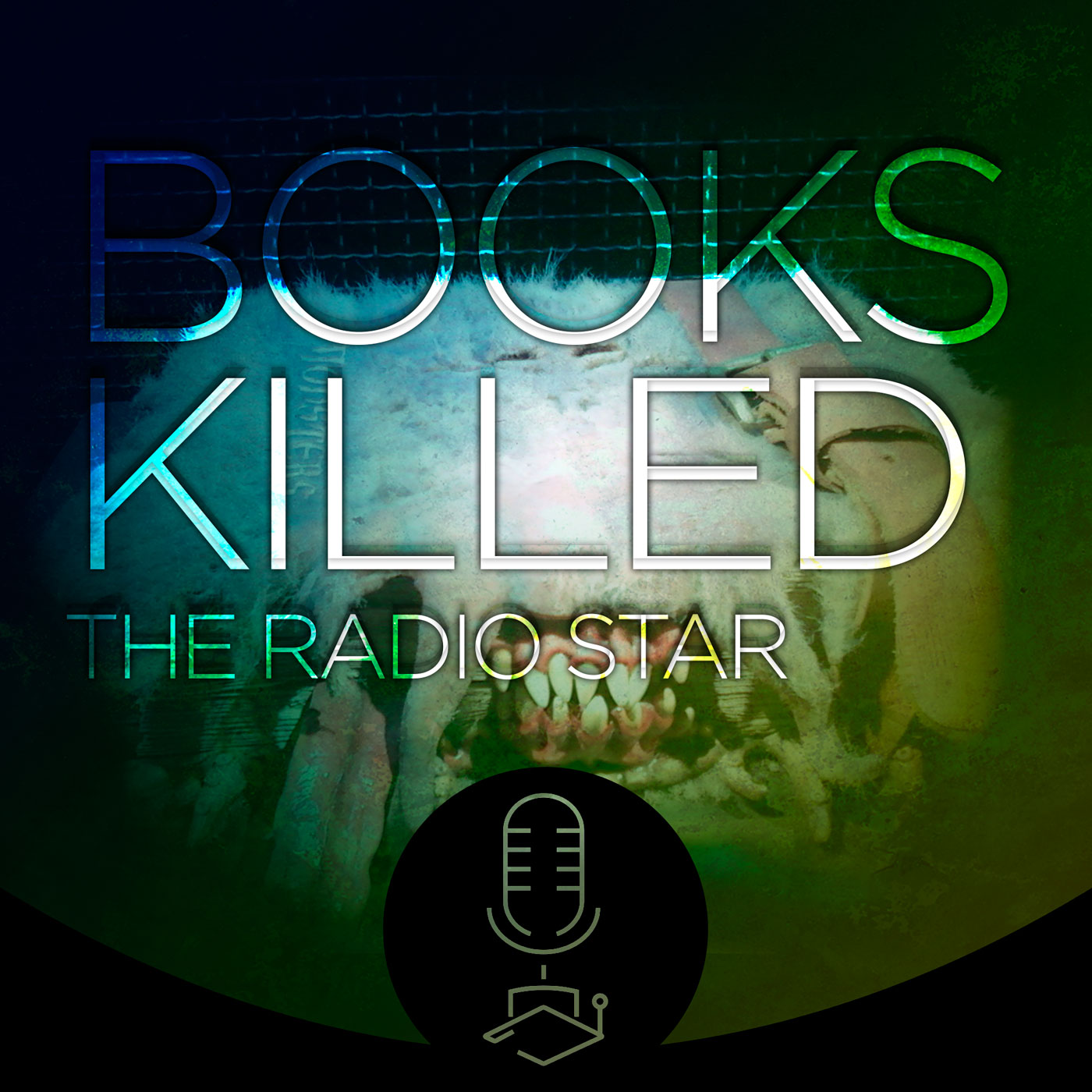
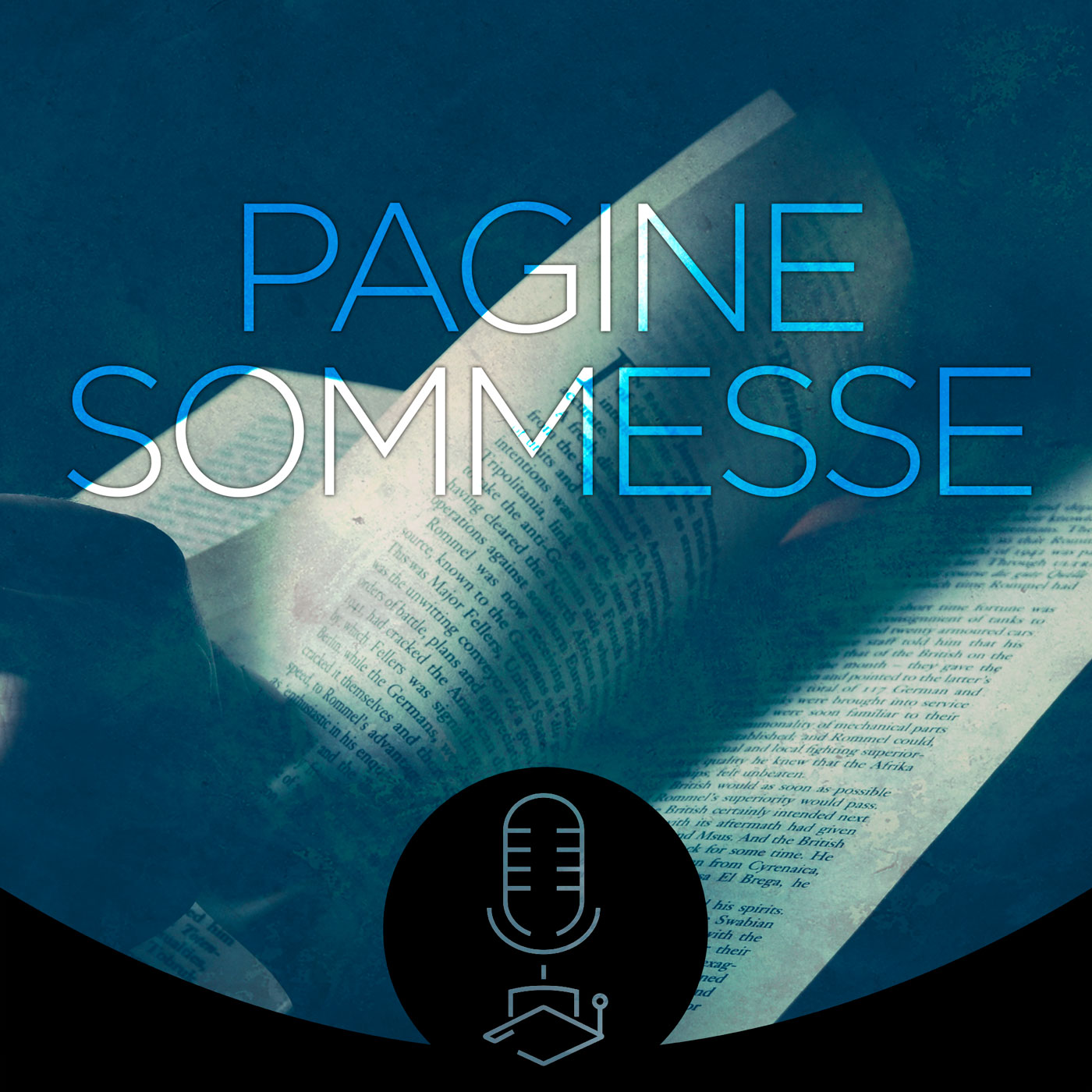
Radio Statale launch roster


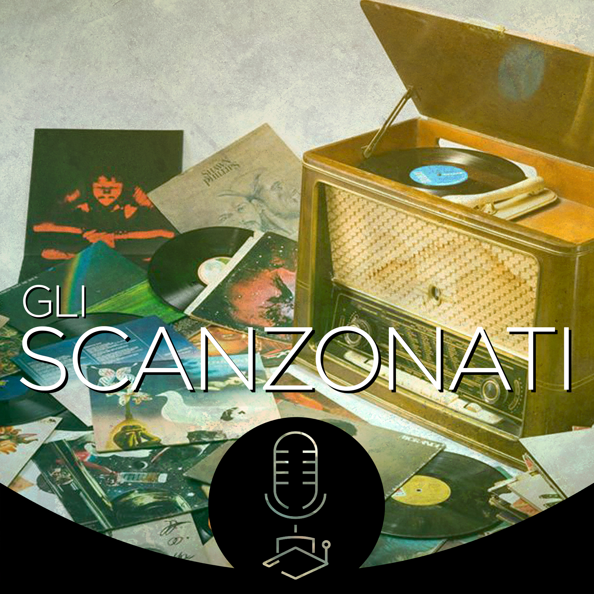


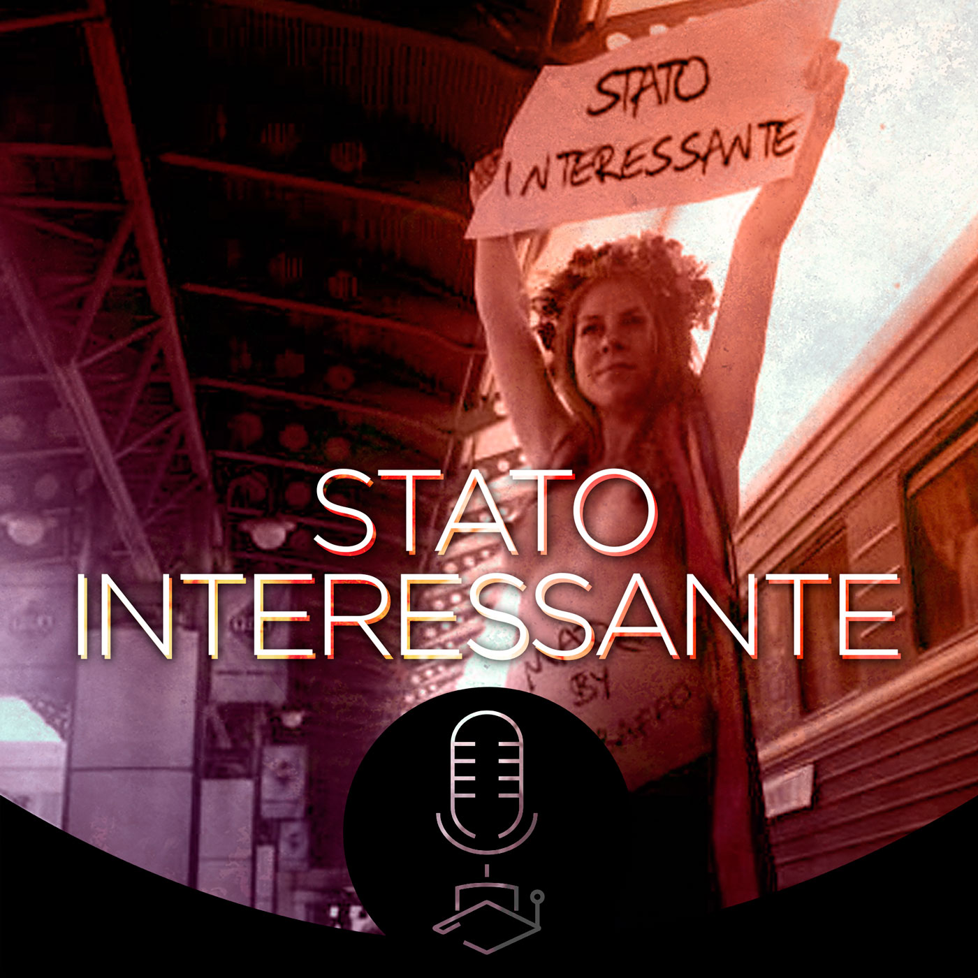


I designed the cover art for all broadcasts for Radio Statale. A single format unifies and calcifies the identity of the radio — the black, curved frame with the logo carved in transparency, the titles in Gotham Light, the dashed icons like the logo of the flagship transmissions, a single texture blended on all the images as a finish. In the background, a stock selected for each show, coloured by an exclusive gradient for that show.