Made with Alchimi–e by Diego Chiaudani
The Brand

The brand, originally drawn by hand in the 50s, had previously been digitalised coarsely and was edited in various colours.
During the redesign we decided to define the identity of the company by going all–in with a color that became the company's signature: the Bistro.
The noncolor of the last decade, clean yet warm, the bistro was the point from which Erbaflor got rebooted, from scratch. The palette informed the design of the packaging of each of the 500 products, and in the furnishing of stores.
The Amber
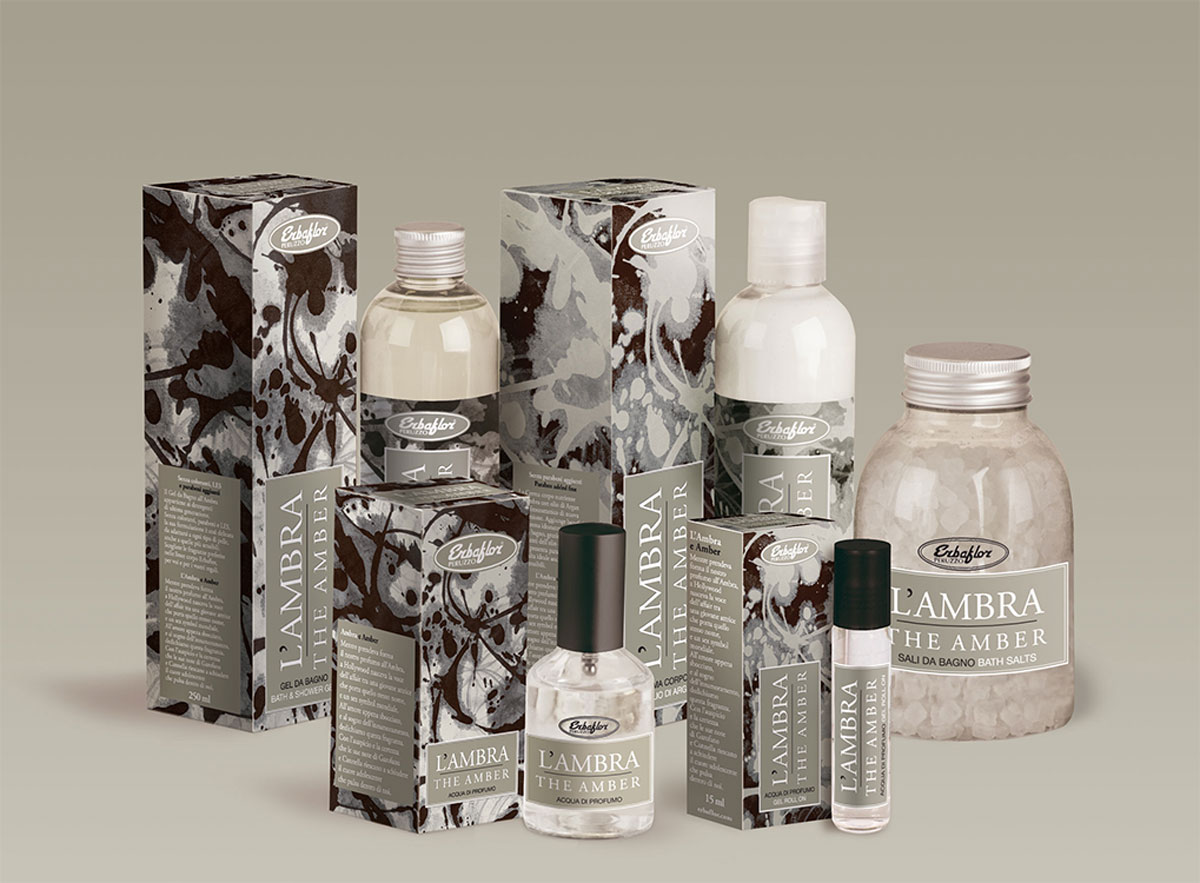
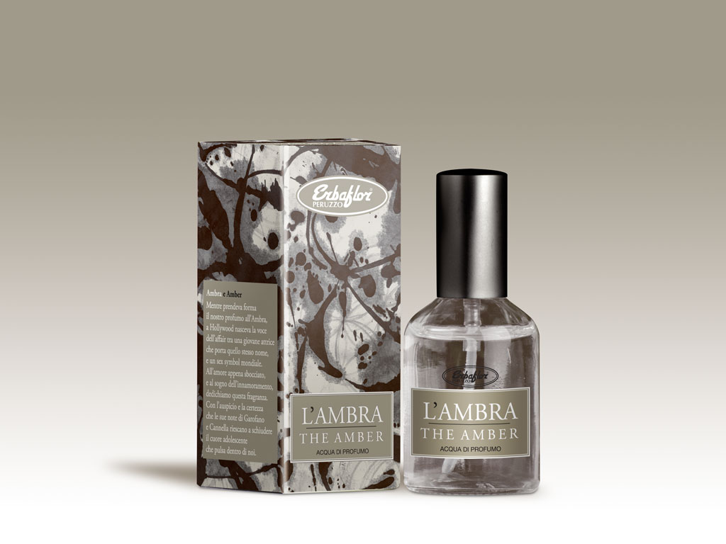
Natural follow–up of the second generation of Natural Cosmetics products introduced by the Christmas rose, the Amber updates the traditional format of Erbaflor perfumed lines for an even more refined product.
On the packaging, reproduction of a work by the celebrated local artist Pietro Bisio.
The Christmas Rose
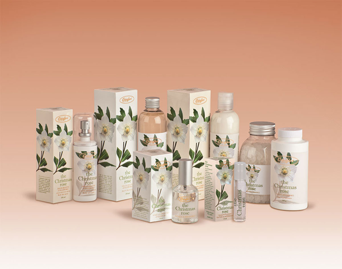
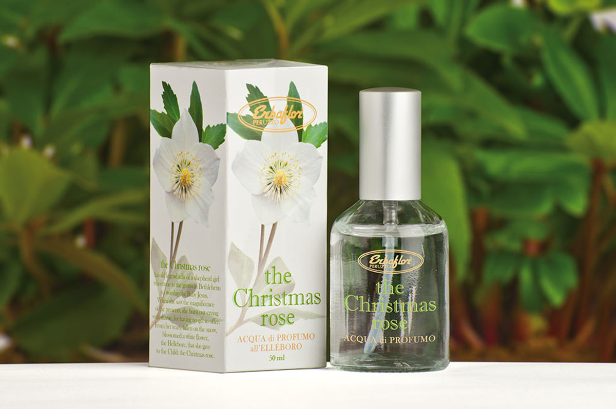
First product of the second generation of the Erbaflor perfumed lines, the Christmas Rose is a brave essence that required a work of great refinement. The goal: a Christmas product — but a fragrance that could be worn all year round, and sold, all year round.
Amaro Peruzzo

The Erbaflor brand is shrouded by an almost magical tradition. Founded by Iginio Peruzzo, an ancient herbalist surrounded by the myth of being almost a healer, the company asserts the origin of so much of its fomulas to their founder, a true to life character that sets the company apart from the competition.
The Amaro Peruzzo, an original recipe by Iginio, has been re-proposed as an exclusive product for Christmas 2014.
On the packaging, intricate in shades of green pine, an ancient map of the lower Apennines where Peruzzo was looking for its herbs. The typeface is ITC Korinna and helps bring the retro look alive.
Erba Persa di Portofino
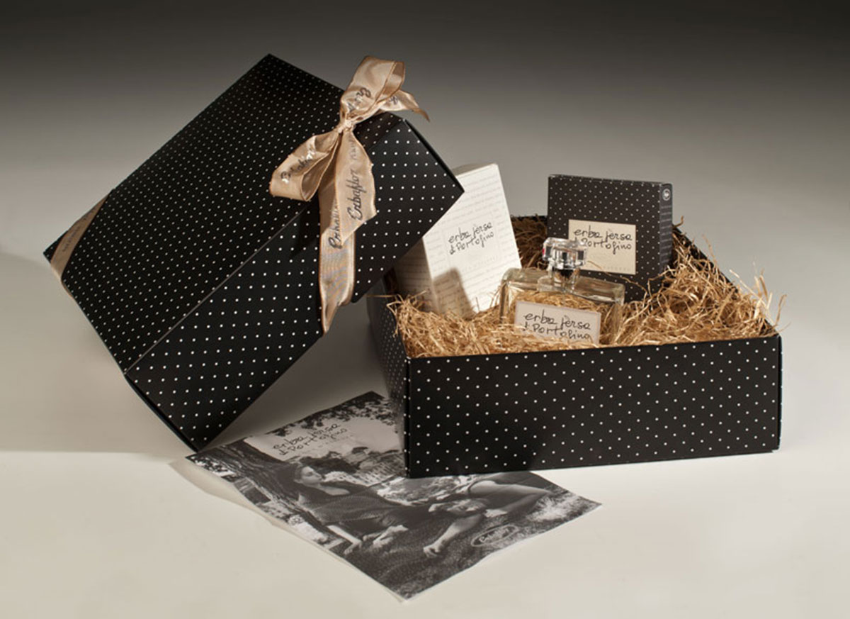
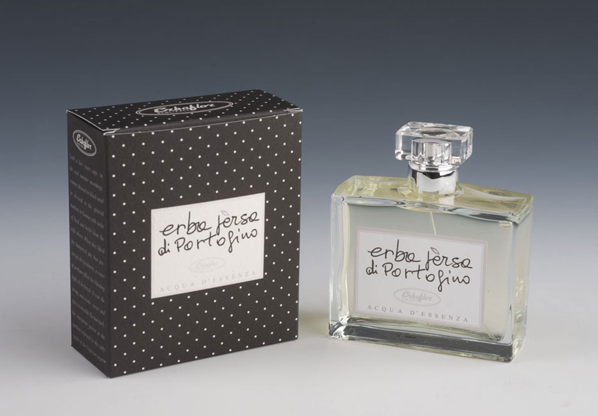
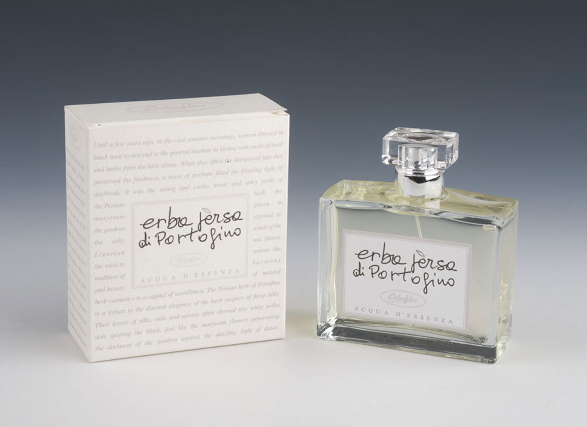
First created for the opening of the Erbaflor temporary shop in Portofino, it represents for the company the turning point towards a higher profile.
Presented in double packaging — the white one being a now rare limited edition with the concept of the product engraved.