The Emblem

The logo encapsulates a very aggressive line–art inside an orange circle in a graphism the eye immediately reads as a basketball. The lion–ball grows from here to become the primary logo for the team. In the emblem, a monogram with a B carved in the D of Derthona works as a second, more discrete, mark.
While the monogram is drawn from City, we chose a cleaner, more streamlined look for the brand's primary typeface. Museo Sans ended up being a perfect fit.
The Uniform
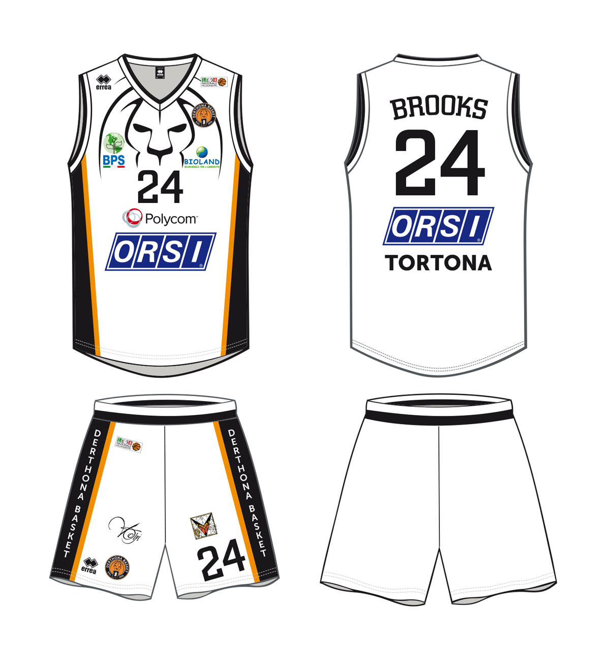
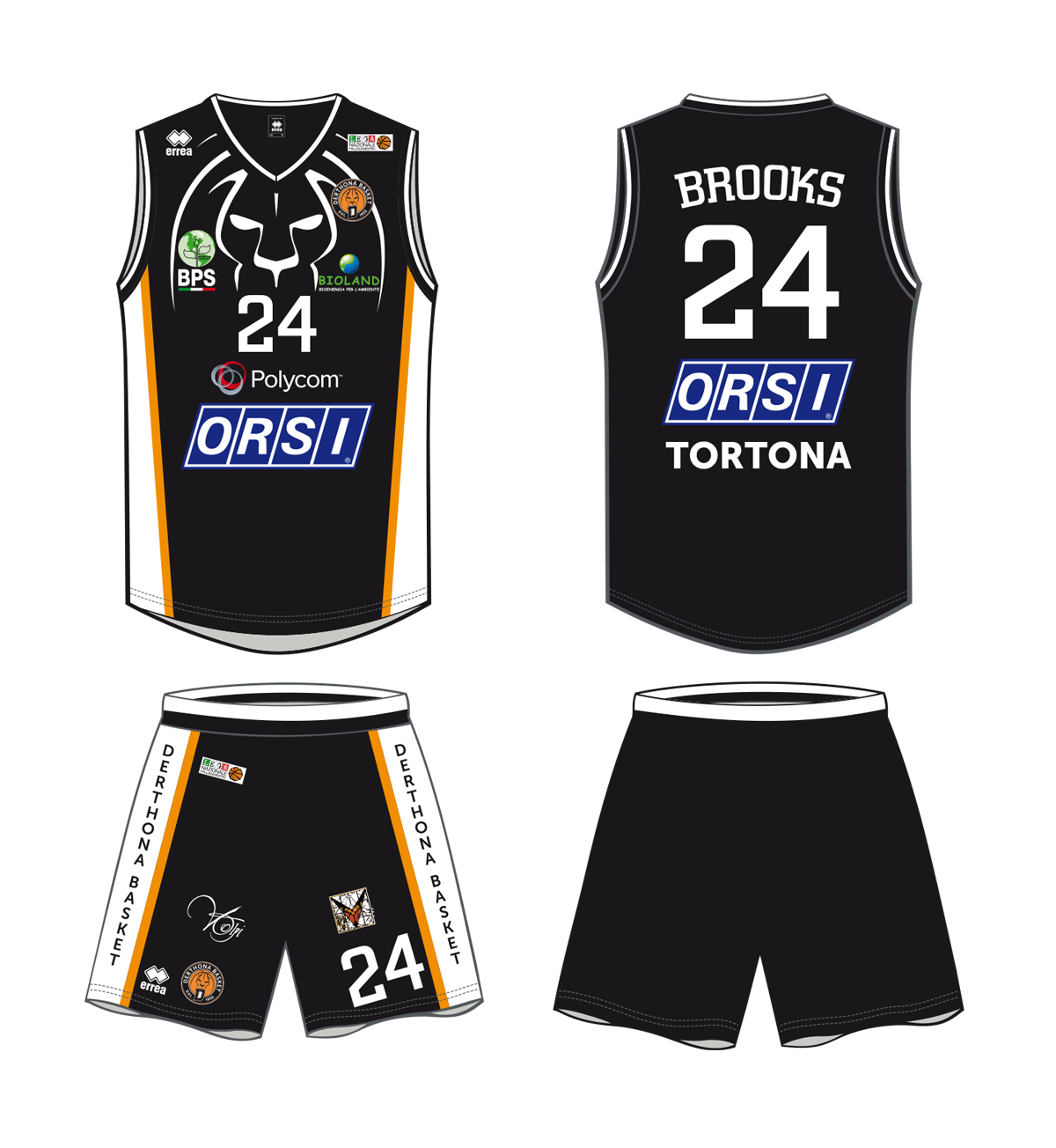
Together with a new emblem and identity, the team uniform needed a complete reboot to be suitable for the nationals. Since the beginning of the project, we had the idea of using the lion line–art almost like a superhero insignia. The new uniform is available in white for home games and in black for away matches.
The player’s name and number are set in City Medium.
T-Shirts
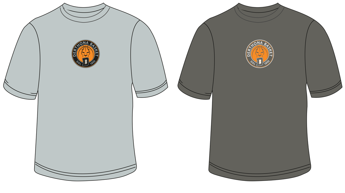
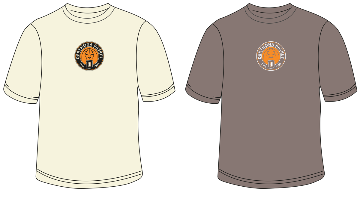
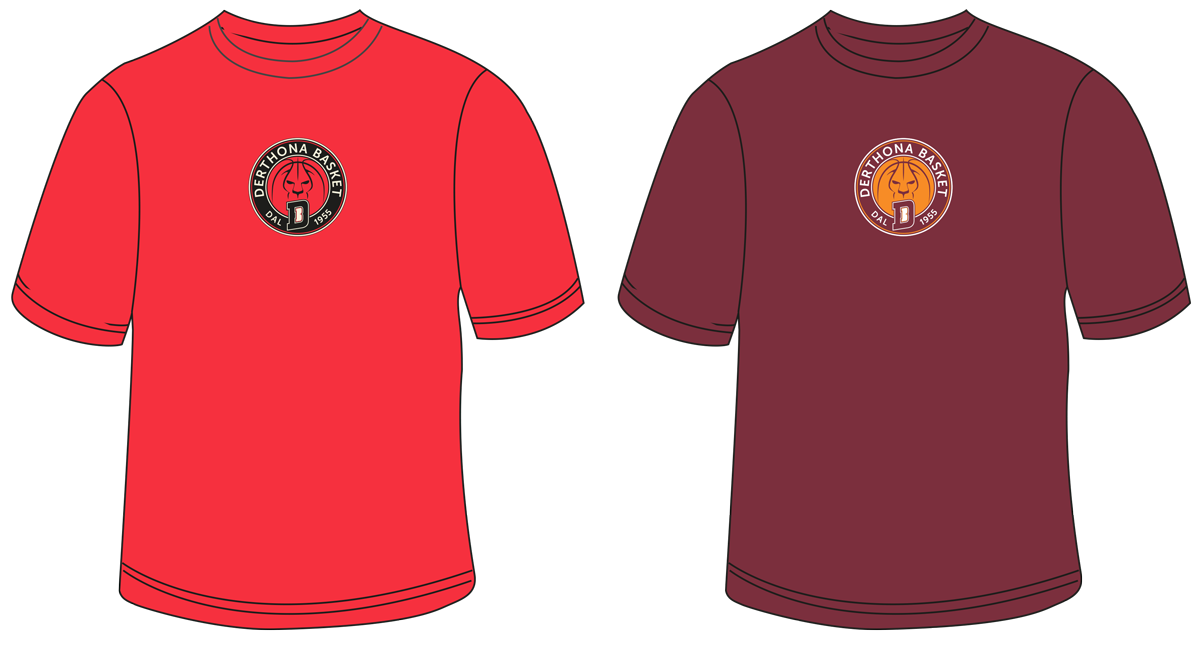
Colorful t-shirts bring the teams logo outside the gym, and possibly in the hands even of non–fans. We screen printed the logo only 12 cm small on vintage tri-blend t-shirts.
in collaboration with Alchimi–e